













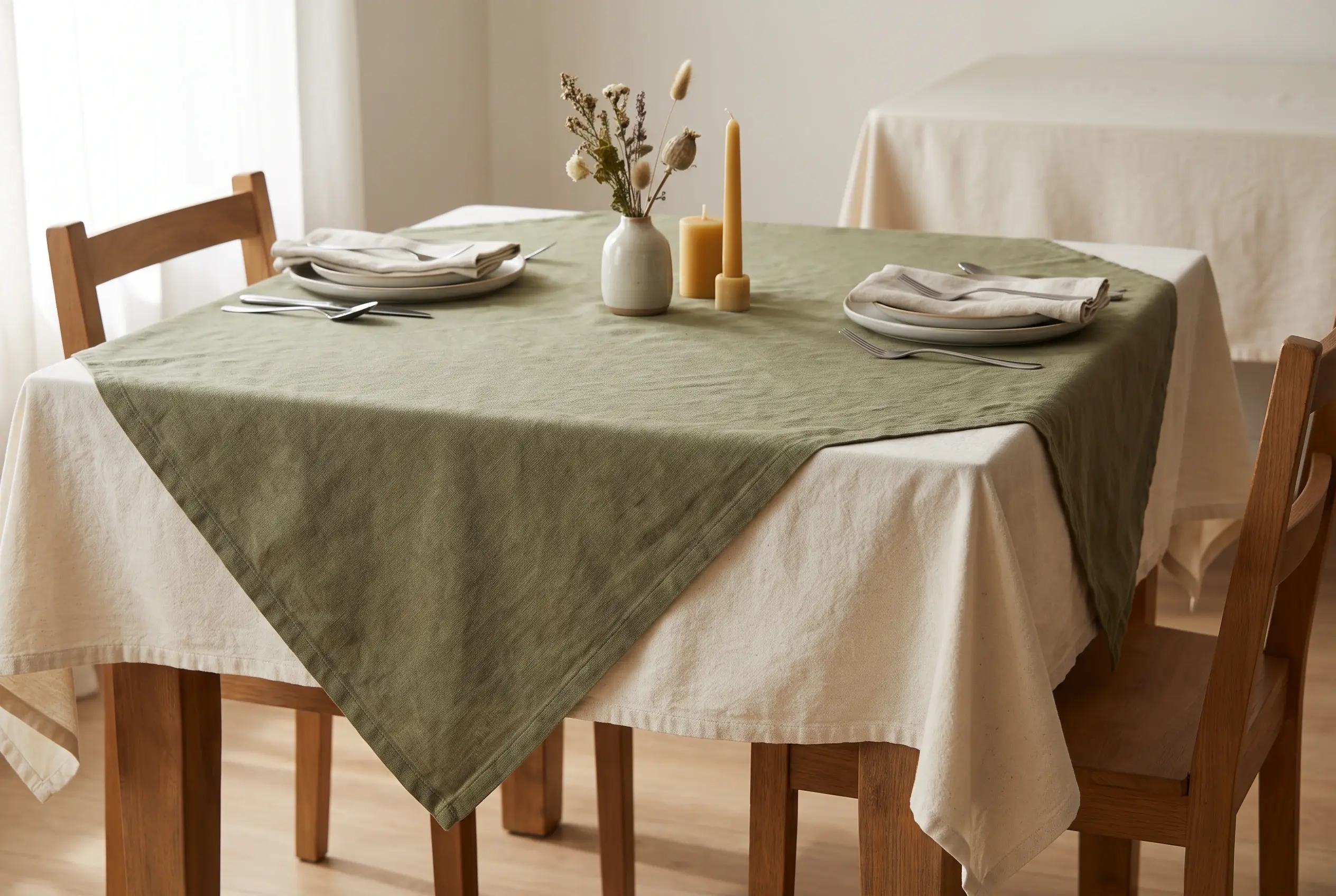
An overlay is a separate linen layer placed over a base tablecloth. Its role is not to solve every table-linen decision. It gives a selected table a deliberate second surface, which can change colour, contrast, texture or the visual focus of the setting without changing the underlying cloth choice. That makes choosing overlays for a table linen rental order a product-mix decision: should this table use the base cloth alone, or would an extra layer make the intended setting clearer?
Start with the visual job, not the item name
An overlay is often described as a decorative extra, but that description is too vague for an order. The useful question is what the upper layer needs to achieve from a guest's viewpoint. It may introduce a contrast against a neutral base, make a central table read differently from surrounding tables, or create a contained field beneath a floral arrangement, display piece or shared table element.
Those are different jobs. A contrast layer needs enough distinction to be noticed without competing with every other object on the table. A focal-table layer needs to identify the table as intentional, rather than merely more heavily dressed. A centre layer needs to frame the element it supports while leaving place settings readable and usable.
Writing down the job in a short phrase helps prevent an unfocused order. "Add a darker central layer to selected tables" is a decision. "Use overlays where suitable" is not. The first can be assessed against the available product options and the planned setting. The second leaves the decision to whoever happens to prepare the room.
Decide which tables genuinely need a second layer
Consider the tables as a group. Some may form the main arrangement, some may sit at an entrance, some may support a display, and some may be intended to remain quiet so other elements can stand out. The overlay belongs where it improves that hierarchy. A selected group of tables can carry a more pronounced colour or material contrast while surrounding tables remain on the base cloth, provided the relationship looks intentional from across the room.
Look at the base cloth and overlay as one composition
The base cloth and overlay should be evaluated together, rather than as separate items. A strong overlay can look refined on one base and harsh on another. A lightly textured upper layer may add depth to a plain cloth, while the same pairing can become visually crowded when the base already has a pronounced finish or colour.
Begin with the background that the base cloth creates. Is it intended to recede, offer a soft colour field, or provide a formal frame around the table? The overlay can then either reinforce that direction or create a controlled contrast. A pale upper layer on a deeper base can lift the centre of the table. A darker overlay on a lighter base can create a more defined focal field. A similar-toned pairing can be effective when texture, rather than colour, is the point of difference.
The test is not whether the two pieces look attractive in isolation. Place them together with the objects that will actually sit on the table. Look at the relationship from standing height and from a seated position. If the overlay makes glassware, menus, place cards or a centre element harder to read, it is carrying too much visual weight. If it disappears completely, the rental order may not need it.
Use shape to control what the eye notices
The shape and placement of an overlay affect the way the upper layer sits within the base cloth. A square overlay, if available in the required size, can be turned on the diagonal to create visible points and a more pronounced frame. Aligning it with the table edges produces a quieter, more ordered effect. Other shapes may suit different table layouts, but check the available options before specifying a particular shape for the rental order.
Choose the base cloth for coverage and the overlay for the visible composition above it. Then check them together: an attractive diagonal corner still needs to fall clear of chairs and the service route. Record the chosen orientation so the effect can be repeated during set-up.
Consider colour as a relationship, not a standalone choice
Colour selection for overlays works best when it is based on the relationship between the upper layer, the base cloth and the existing room. A colour that looks balanced under one lighting condition can dominate when it meets darker furniture, patterned flooring or a strongly coloured wall. The overlay should therefore be tested in the actual visual environment where possible.
This approach also helps when a familiar palette is already in use. An overlay does not have to introduce a completely new colour. It can repeat an existing accent in a more concentrated way, or soften a high-contrast base by adding a related tone. The important point is that the upper layer should create a deliberate relationship. It should not be included simply because a second fabric layer appears more elaborate.
Test the setting at the level people will experience
A layout can look balanced from directly above and still feel crowded once chairs, place settings and centre elements are in position. Where the restaurant can assemble a test setting, the most useful check is a fully dressed table. Add the base cloth, overlay, typical setting elements and the centre feature that will occupy the surface. Then look at it from the room entrance, from a nearby table and from a seated position.
Australian hospitality training guidance includes checking the dining environment for customer comfort and ambience. Use that wider setting when judging whether an overlay adds a useful focal point or simply crowds the table.
Keep the product-mix decision separate from later order work
Record the chosen treatment for each table group: base cloth only, base cloth plus overlay, or a focal table with its own overlay arrangement. Include the colour pairing, any available product details and the intended orientation. This makes the styling decision specific enough to discuss when confirming linen requirements.
For Perth restaurant operators, Cleantex's restaurant linen range includes tablecloths, overlays and napkins. Compare the intended tablecloth and overlay combination with the available materials, sizes and colours. Check the available options before assuming that every combination, shape or dimension can be supplied.
For a managed linen rental arrangement, include the required tablecloths and overlays when discussing linen volumes and service schedules with Cleantex. Identifying which tables use an additional layer can help clarify the quantities needed for the restaurant's regular linen requirements.