













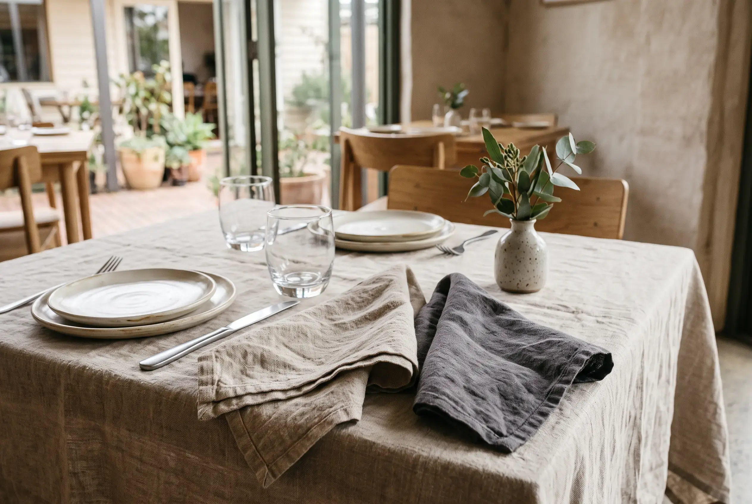
Napkin colour and material affect how a restaurant table setting looks and feels. Colour influences how the napkin relates to the table surface, crockery and surrounding décor, while material contributes texture and affects how the napkin sits when folded or placed beside other tableware.
Choosing between options requires more than selecting a shade that looks attractive on its own. The colour needs to work with the existing table palette, and the material should complement the style of the dining area while meeting practical requirements for presentation and care.
Choose Colours in Relation to the Table Setting
Start with the most prominent colours already present, particularly the table surface, crockery and tablecloth. These provide the context for deciding whether napkins should blend into the arrangement or create a contrast.
A coordinated palette uses colours that sit comfortably alongside one another. Warm neutral shades, for example, can complement natural timber finishes, while similar tones across the table linen and crockery create a more understated appearance. A contrasting shade, such as a dark napkin against light tableware, makes the napkin more noticeable.
Neither approach is automatically better. The decision depends on whether the napkin should contribute quietly to the setting or become a more visible part of it.
Consider How Colour Repetition Affects the Dining Area
A colour can look subtle on one table but become much more prominent when repeated throughout a dining area. This matters when the same napkins will be used across multiple tables.
Using one colour throughout can create visual consistency, particularly where tables share similar finishes and tableware. Different colours may work in separate dining areas with distinct styles, but introducing several shades without considering their relationship can make the overall presentation feel less coordinated.
Assess the colours across the full dining space rather than judging each table in isolation. The cumulative effect of repeated napkins may be quite different from their appearance in a single place setting.
Compare Material Characteristics Separately
Napkins in similar colours can look different because of their material and surface texture. A smooth fabric creates a different appearance from a more textured one, while differences in thickness can affect how the napkin sits when folded.
Consider how the fabric will appear during service, not only when it is first presented. Some materials may hold a structured fold more readily, while others create a softer or more relaxed finish. The choice should reflect the intended table presentation rather than relying on appearance alone.
Practical considerations matter as well. Check the stated fibre composition, care instructions and laundering suitability before comparing options. These details help establish whether a material is appropriate for the restaurant's linen requirements. Fabrics that look similar may have different care needs, so colour and texture alone do not establish their practical performance.
Assess Colour and Material Together
After considering colour and material separately, compare how the two work together. A particular shade may look different depending on the fabric's texture and finish, so assessing colour samples without considering the material can give an incomplete impression.
Where physical samples are available, place them beside the crockery and table surface with which they will be used. Compare their appearance under the lighting found in the dining area, as surrounding colours and light conditions can influence how a shade is perceived. The Australian Government's business lighting guidance provides further information about daylight and lighting considerations in commercial spaces.
For example, charcoal beside ivory crockery creates a stronger contrast than warm grey. The difference is not simply between two colour names; it is also about how each shade relates to the other elements on the table.
Keep a Clear Record of the Selected Option
When a colour and material have been chosen, record their descriptions and any available product references. This makes it easier to refer to the original selection when comparing alternatives or discussing future linen requirements.
Avoid relying on broad descriptions such as "neutral", "soft" or "elegant". These terms can mean different things to different people and may not identify the actual shade or material selected.
If a restaurant uses a managed linen arrangement, the restaurant linen hire range includes napkins, tablecloths and overlays in a choice of sizes, materials and colours. Keeping the selected product details clear can help when discussing linen requirements and comparing available options.